EKO is the customer’s preferred choice in the Southeast European petroleum market, placing emphasis on quality products and services, the development and utilization of human resources, the environment, and social sensitivity.

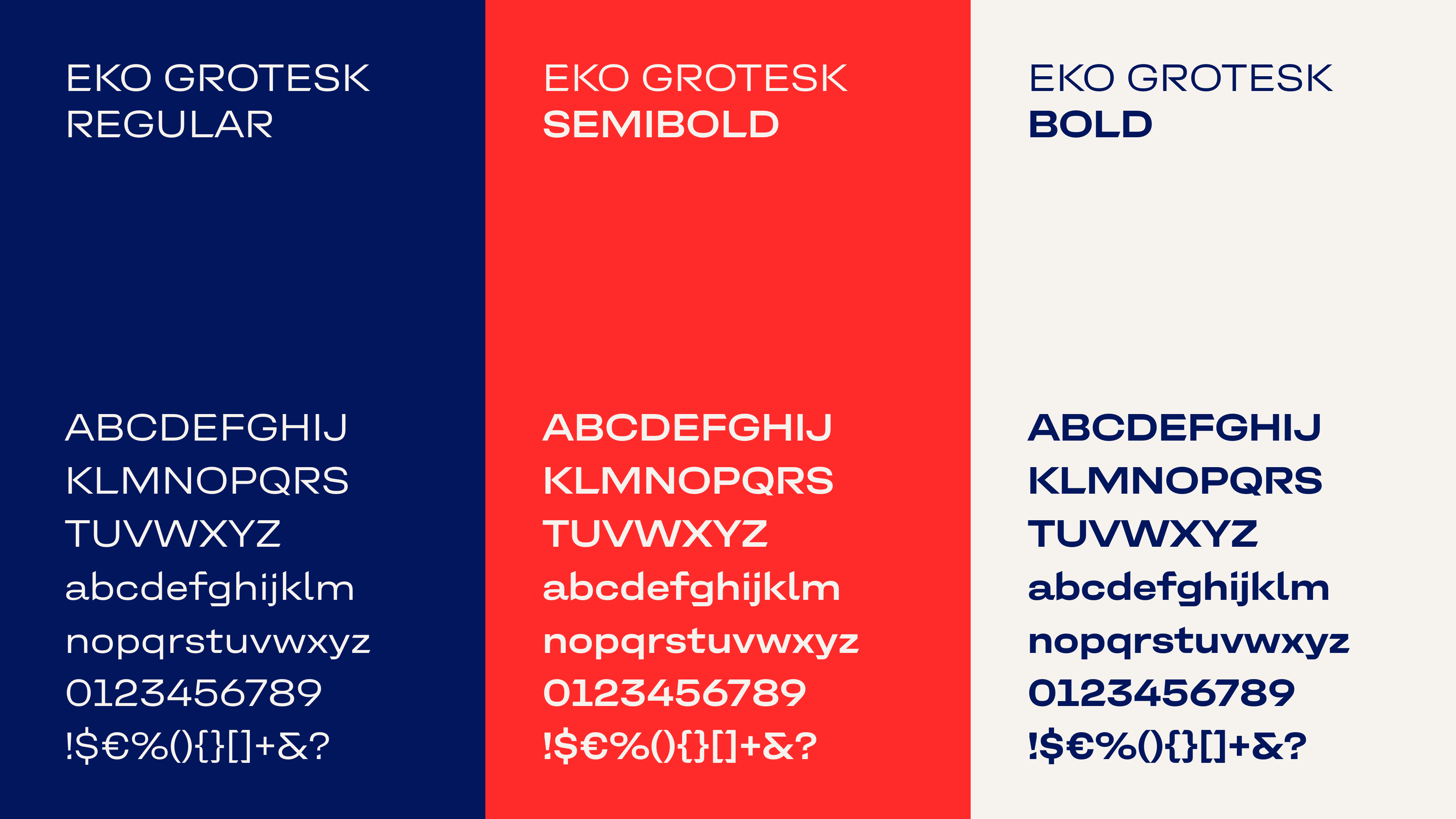
In collaboration with the design agency Mutabor, a revamped design system was developed that included the creation of a new brand typeface. The new typeface allows EKO to communicate in a fresh and distinctive way.


The starting point for the design was the angles contained in EKO’s picture mark. These formed the basis for the angular, cut-off terminals. The apex, derived from the center of the logo, was incorporated as a defining element to emphasize the brand’s dynamic and flexibility.


The contrast between humanistic features and technical shapes gives the typeface its distinctive character.


Since EKO primarily operates in Greek and Cyrillic-speaking regions, the typeface family was developed in three scripts: Greek, Cyrillic and Latin.


The typeface family was developed in three weights: Regular for body text, as well as SemiBold and Bold for headlines. Each weight includes over 700 characters and is optimized for every typographic use.


