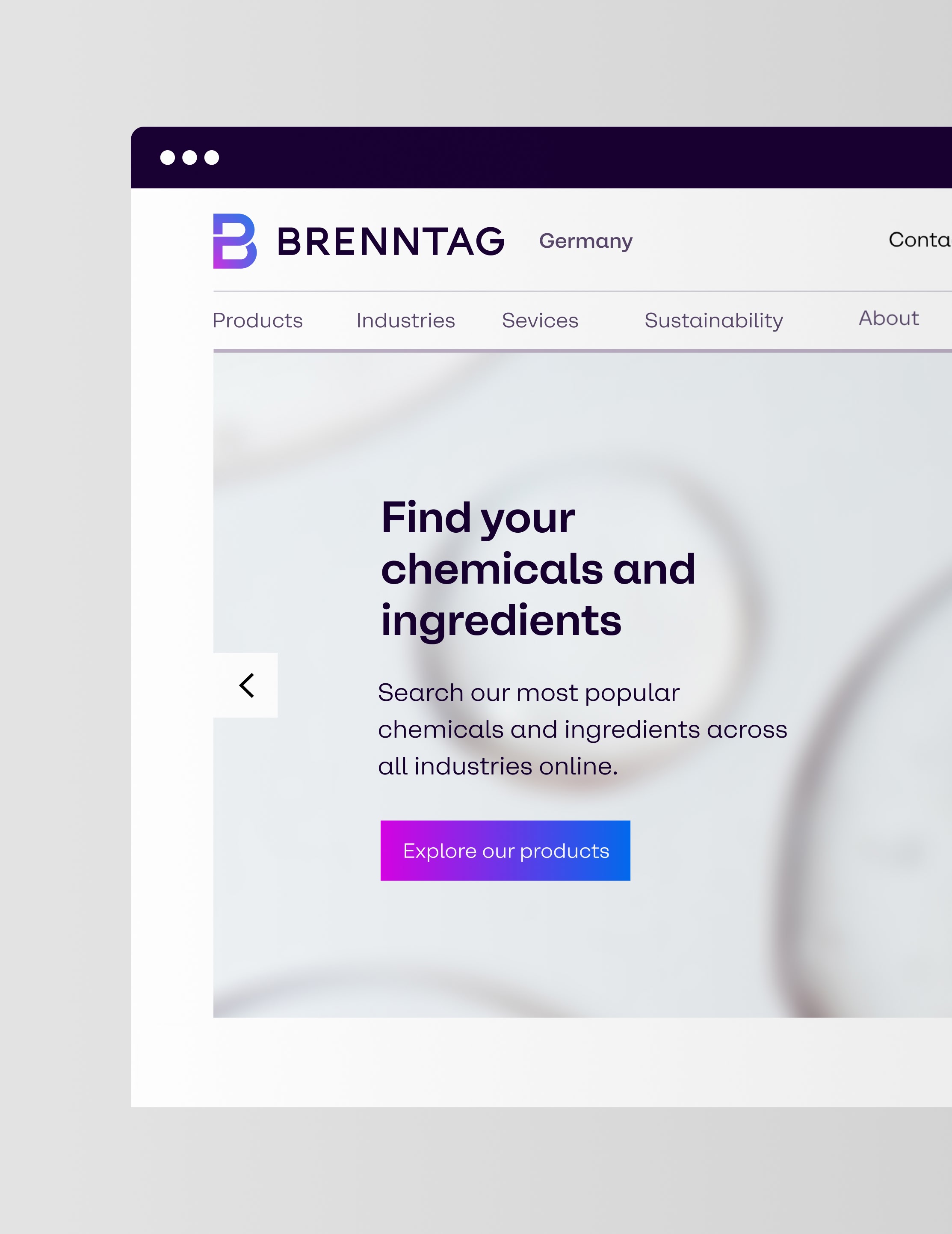
Brenntag is a global market leader in chemical and ingredients distribution. For their 2022 rebrand, Hamburg based design agency Mutabor commissioned a custom typeface that works as one of the main ingredients of the new identity.


Brenntag’s new brand strategy emphasised the convergence of people and technology. To support this direction, the custom typeface combines the clarity of a contemporary grotesque with carefully integrated humanistic details. The result is a functional corporate typeface that balances precision, warmth, and long-term usability across global applications.


The type family consists of six standard-width styles and six space-saving variants for text-intensive applications. Each subfamily ranges from Regular to Black and features an extended character set. Together, they provide the flexibility and consistency required across Brenntag’s global print and digital communications.


To support Brenntag’s global operations, the typeface was developed in three scripts: Latin, Greek, and Cyrillic. Together, they provide support for more than 200 languages, ensuring consistent communication across international markets.