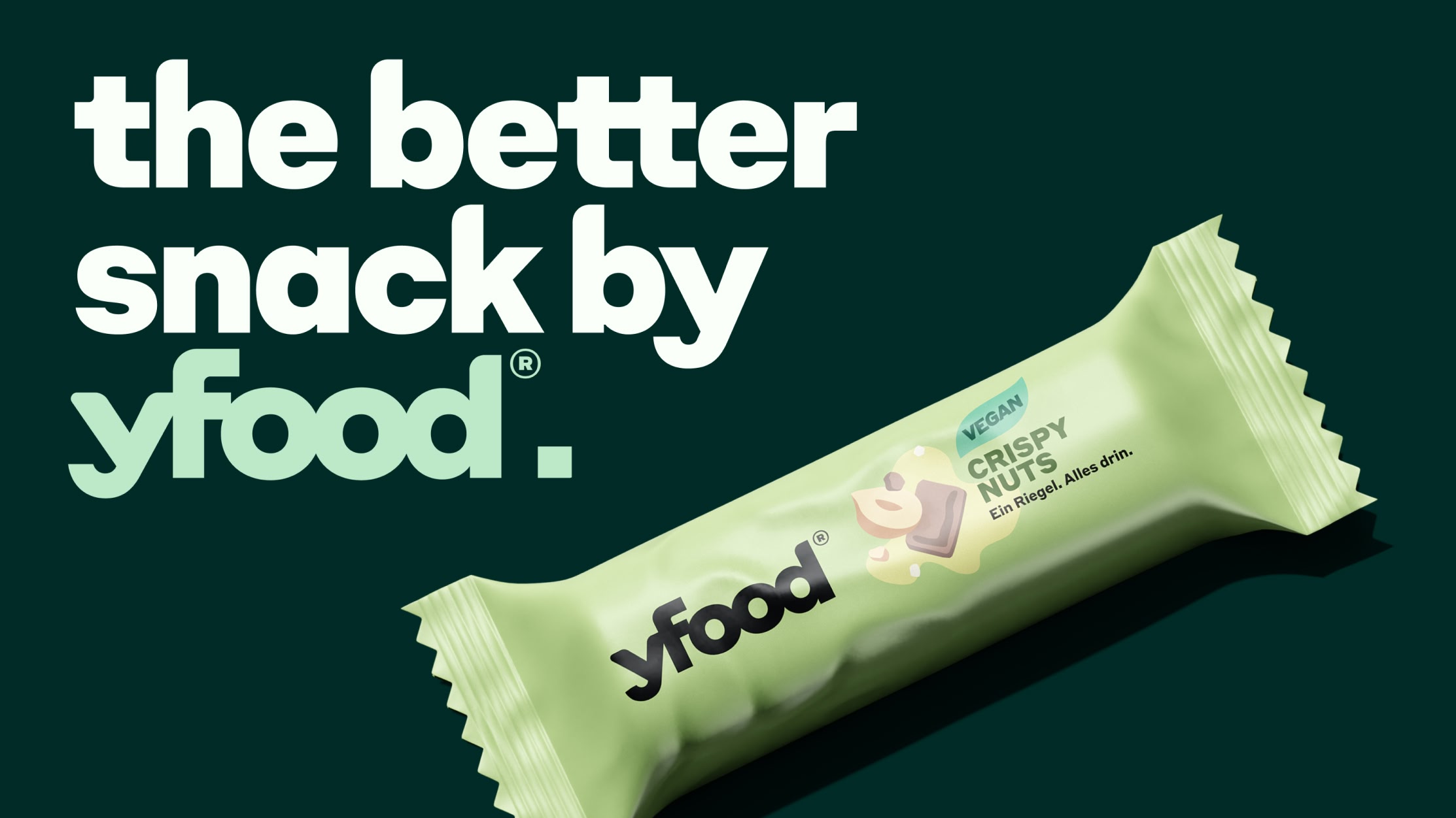
yfood is a Munich-based food brand offering nutritionally balanced ready-to-drink meals and snacks. Designed for modern, fast-paced lifestyles, the brand combines convenience, functionality, and a distinctive visual identity.


As part of yfood’s evolving brand identity, Hamburg-based branding agency Mutabor commissioned Studio René Bieder to develop a custom headline typeface. The design translates the brand’s core attributes—bold, smart, and approachable—into a distinctive typographic voice.


Based on Neue Campton, the custom headline typeface builds on its geometric construction, strong presence, and approachable character. A series of targeted refinements aligns the design with yfood’s visual identity and brand values.

Key design features were derived from the yfood logo and its distinctive “THIS IS FOOD” tagline. Curve tension, terminal shapes, proportions, and ligatures were translated into the typeface, creating a cohesive connection to the brand identity.


Inspired by the logo and tagline, the typeface incorporates an extensive set of expressive and functional ligatures. Beyond supporting the brand language, they enable multiple logo variations to be composed directly from the font while maintaining a distinctive and consistent appearance.

The redesigned typeface, named Edge Bold, is defined by a single, striking weight. It brings a distinctive voice to yfood’s communication while reinforcing the clarity, confidence, and approachability of the brand identity.