Studio René Bieder is a Berlin-based type foundry creating tailor-made custom fonts and high-quality typefaces that empower brands to tell their stories with clarity, character and confidence.

The design system, created in collaboration with Deloitte Digital, combines their leadership position as the open source innovator with an optimistic view on the future of tech. The goal of the typeface was to incorporate these characteristics and design a reliable, unique font family that allows SUSE to communicate in a completely new way.


Besides the brand-descriptive adjectives, inspiration was drawn from both new and existing visual brand elements. For instance, the rounded corners from the wordmark were used in shaping specific uppercase and lowercase letters. This gives the font a subtle technical character and strengthens its connection to the wordmark.


To establish a connection to the core of the brand—software development— we integrated features commonly found in fonts used for writing code.


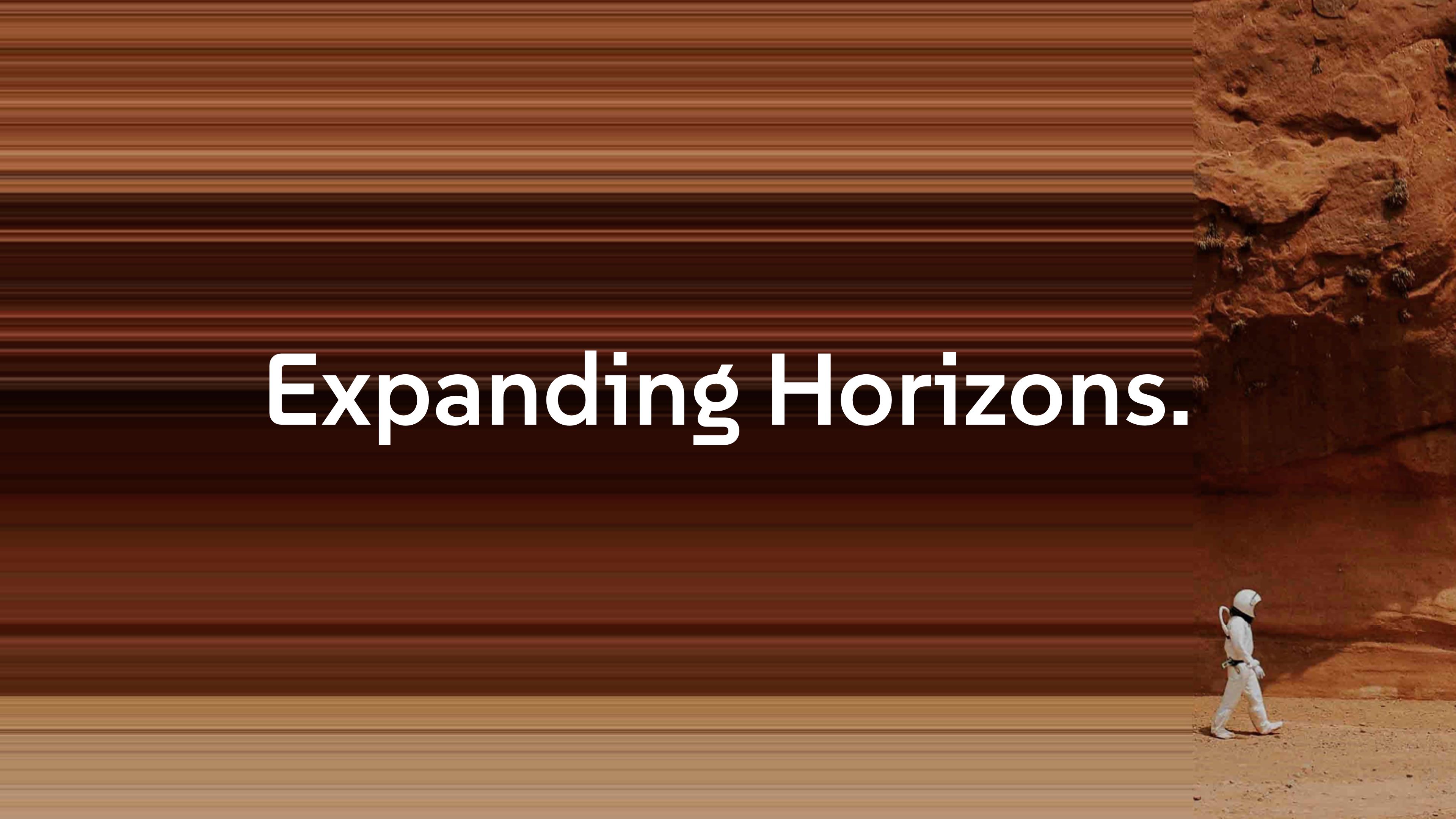
One of the most unique characters is the lowercase ‘g’. Its shape is inspired by a previous exclusive typeface from SUSE. The connection between optimism and technology is shown in its best way here. Additionally, its aesthetic and appearance reminds of the chameleon in the logo.


One of the key brand elements is the so-called Infinity Stream. With its tube-like terminals, serifs, and crossbars, this has been integrated into the typeface design, creating a sense of movement.

The typeface family is generously equipped with eight styles, ranging from the sharp and precise Thin to the bold and striking ExtraBold style. Designed as a variable font, it also allows for additional, finer weight variations to be utilized in multiple design applications. In line with the company’s ethos, the font is available as an open-source font and can be downloaded for free from Google Fonts here.